Context Input Configuration
Fields
| Field | Type | Description |
|---|---|---|
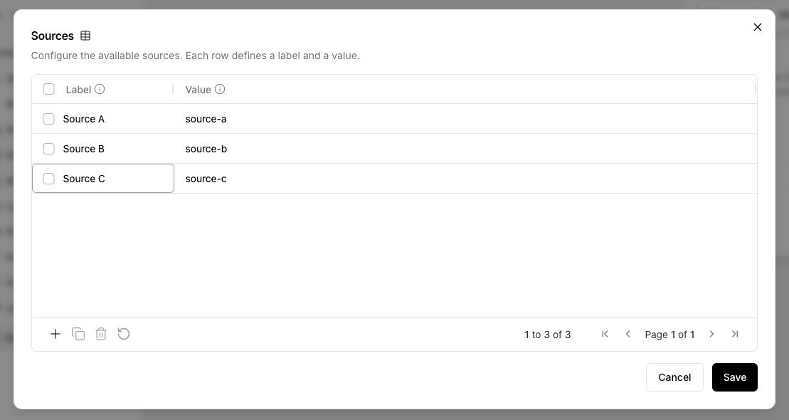
| Sources | Table | The available context options. Each row has a label (shown to the user) and a value (passed downstream when selected). |
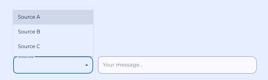
| Label | Text (advanced) | Display label for the selector in the chat. Defaults to Sources. |
| Required | Boolean | If enabled, an unmatched selection raises a validation error. If disabled, an empty Data is emitted instead. |
| Selected Source | Text (advanced) | Populated by Karli Studio at run time. Leave blank in the editor; setting it manually is useful only for testing a specific selection. |
Defining Sources
Add one row per option to the Sources table. The label is what the user sees; the value is what flows downstream and is therefore the field your downstream agent or tool should branch on.
Matching Rules
When a selection arrives, the component matches it against the configured rows:
- First by label (so a user-facing label match always wins).
- Then by value (allowing API callers to address the row by its underlying value).
If multiple rows share a value, the first matching row wins.
Connecting Downstream
The Selected Value output is a Data with value and label. Connect it to any component that accepts Data or text — typically the agent or tool whose behavior depends on the chosen context.
One Context Input per flow
Only one Context Input component can be placed per flow. The canvas enforces this — once a Context Input is on the canvas, the sidebar item is disabled and pasting a duplicate is blocked. This reflects the fact that Karli Studio surfaces a single context selector per flow in the chat.